PORTFOLIO / ● STAGE / PAFU2026
CASE · INVESTOR DECK
Translating a furniture brand
into investor language.
01 · STARTING POINT
A tangled brief, a need for a clear story.
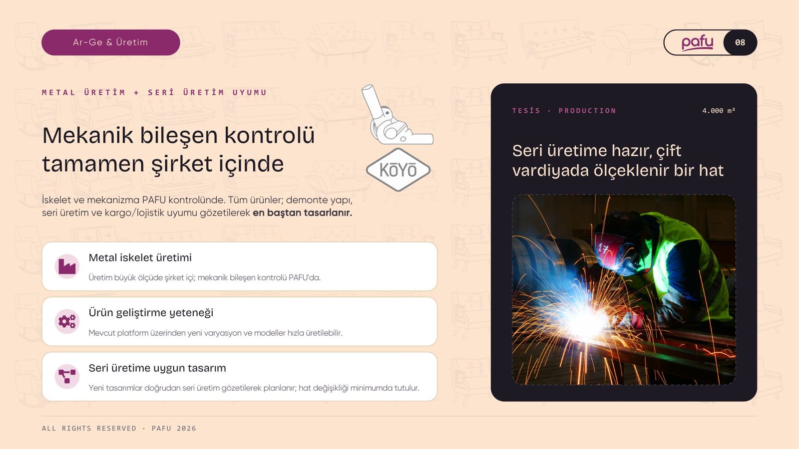
The brief was mixed with agency notes and two slides shared the same number. The strength of a scalable, e-commerce-ready brand with its own production was lost in it.
The first job was not design but order: strategy first, then content, visual language last.
02 · THE ORDER OF THE STORY · 14 SLIDES
PRESENTER NOWSLIDE 01 / 10
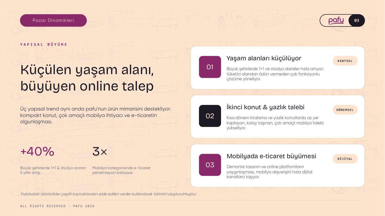
01Market dynamics
06Capacity analysis
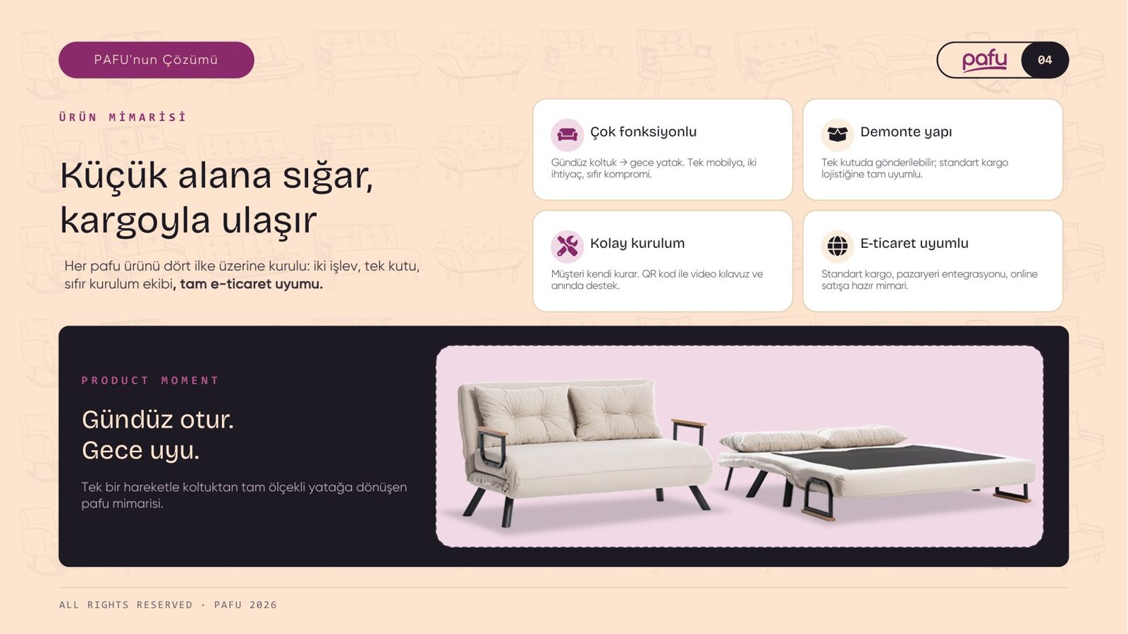
02Product architecture
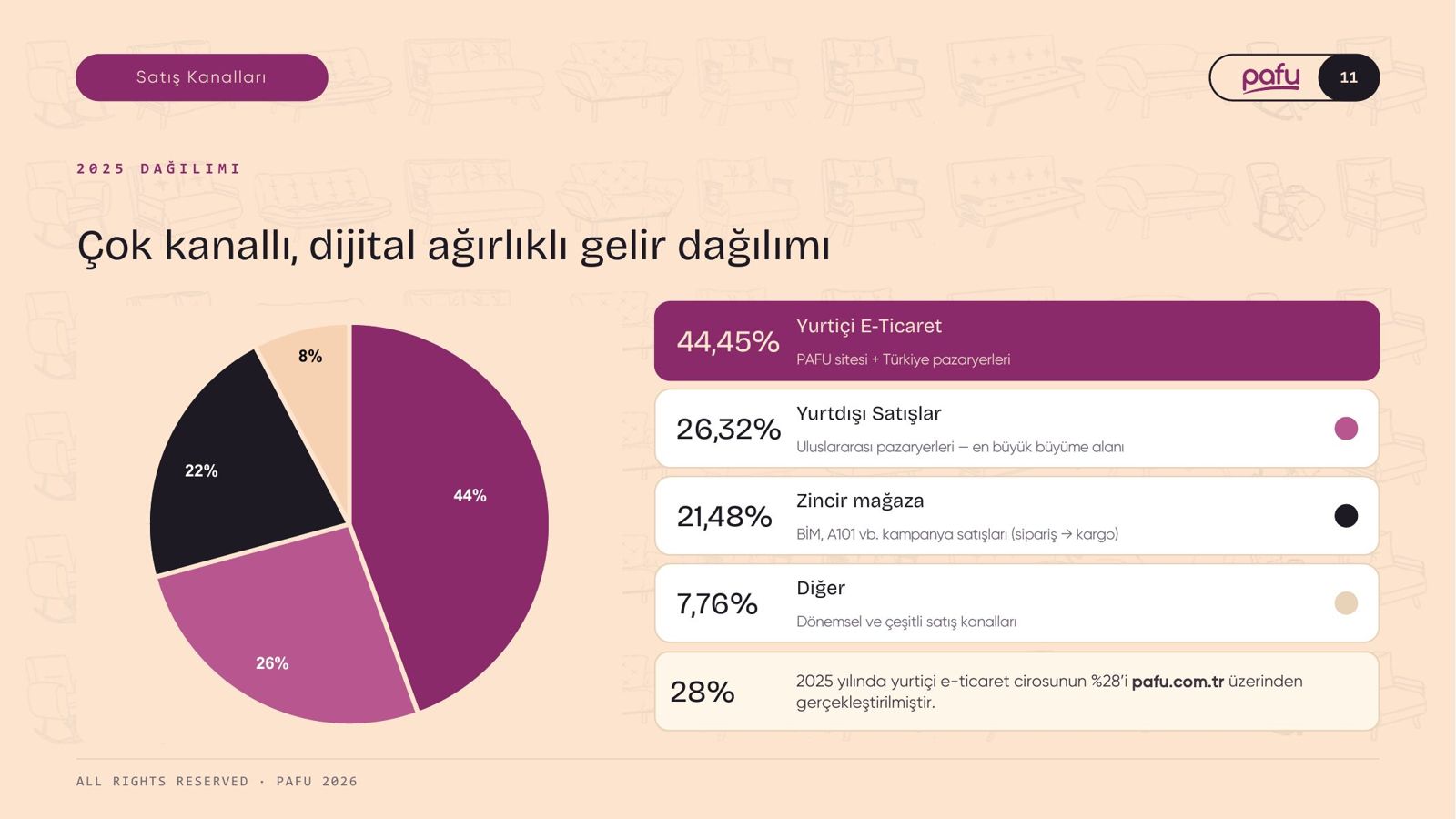
07Sales channels
03Category leadership
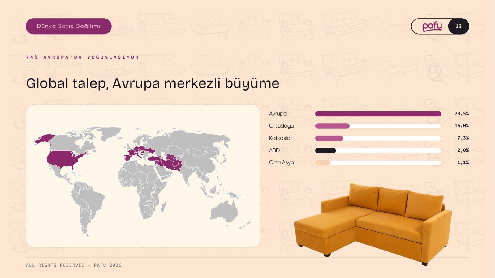
08Distribution in Türkiye
04DTC model
09Technology
05Financial growth
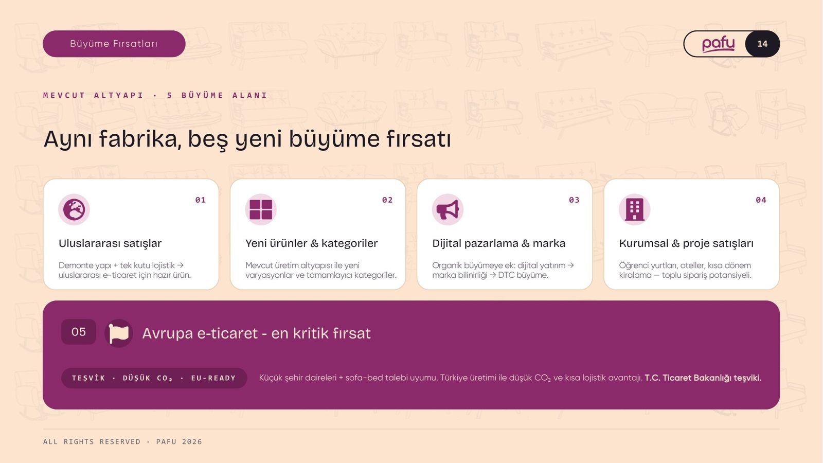
10Why PAFU? · Growth opportunities
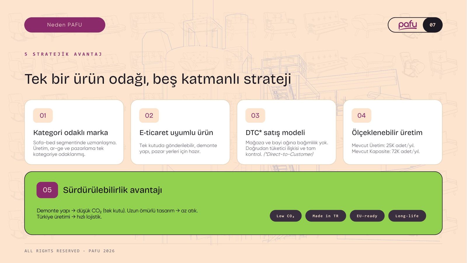
Sustainability did not get a slide of its own; one-box shipping, durable multifunctional design and local production live on the “Why PAFU?” page.
03 · VISUAL LANGUAGE
Colour from the logo, not a guess.
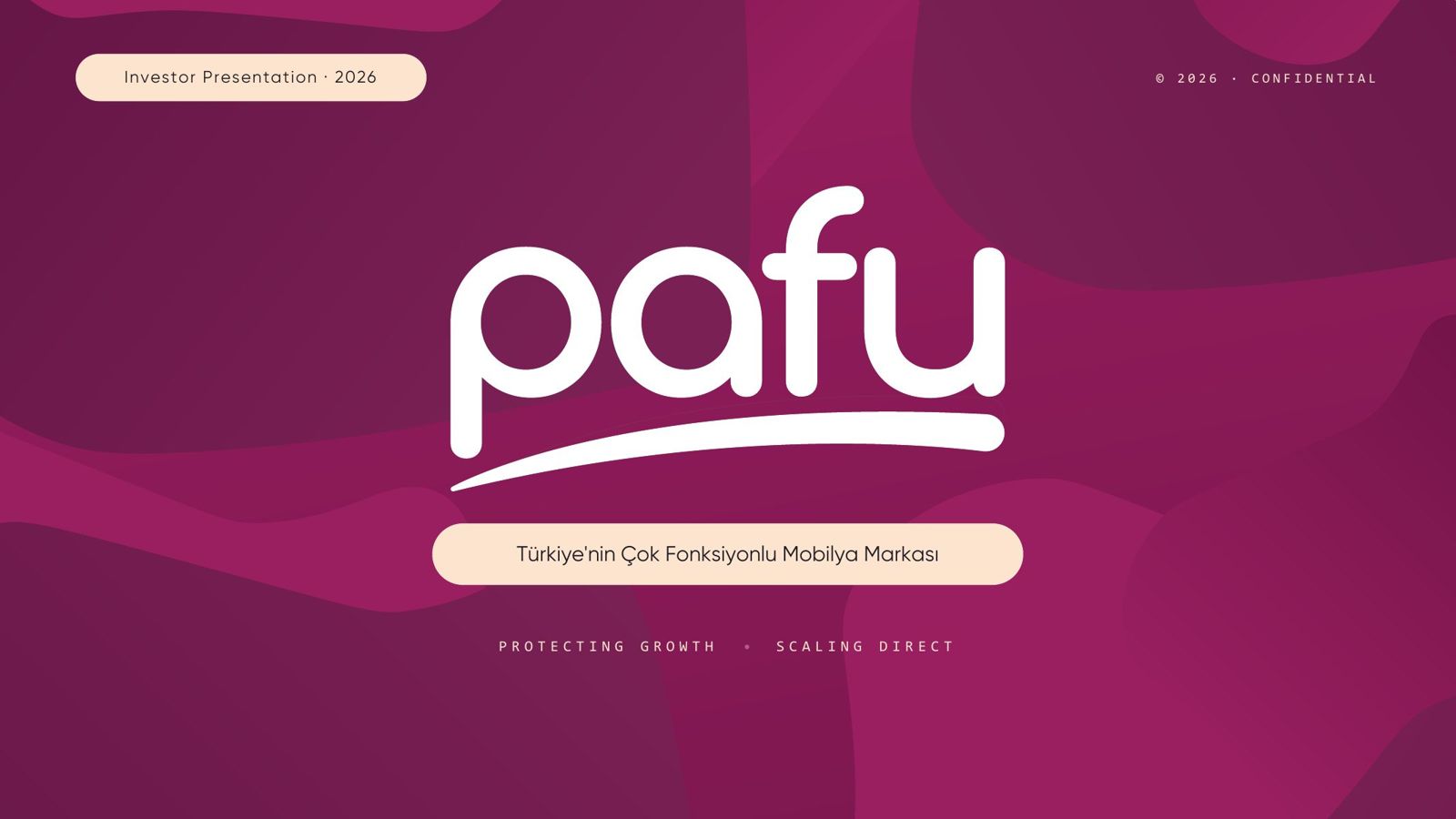
We pulled the brand colour pixel by pixel from the logo file. Instead of cold corporate navy, a warm cream ground and serif type: a furniture catalogue, not a tech deck.
From the deck.