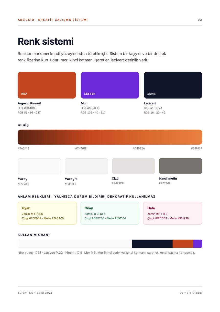
Surface 62%
Navy 22%
Brick 11%
5%
DECISION 01 · COLOUR
argusio is brick red.
Brick red leads, navy gives depth. Purple marks only comparison. Colour is a matter of proportion.
#C4461E#8D28D9#10172A

CASE · ARGUSIO · CREATIVE SYSTEM, SALES NARRATIVE AND DECK · 2026
For a technology and consulting company that measures digital transformation, we built a language it can explain itself with in one sentence. From colour and type to the sales story and the last line said in the room.
01 · STARTING POINT
argusio had a platform that measures, benchmarks and tracks, backed by a wide network of consultants. What was missing was a story an executive could grasp in one breath.
The market is full of thick reports from big consultancies saying the same thing with similar charts. The ask: a visual language that sets argusio apart, and a sales deck in the field within two weeks.
02 · IDEA
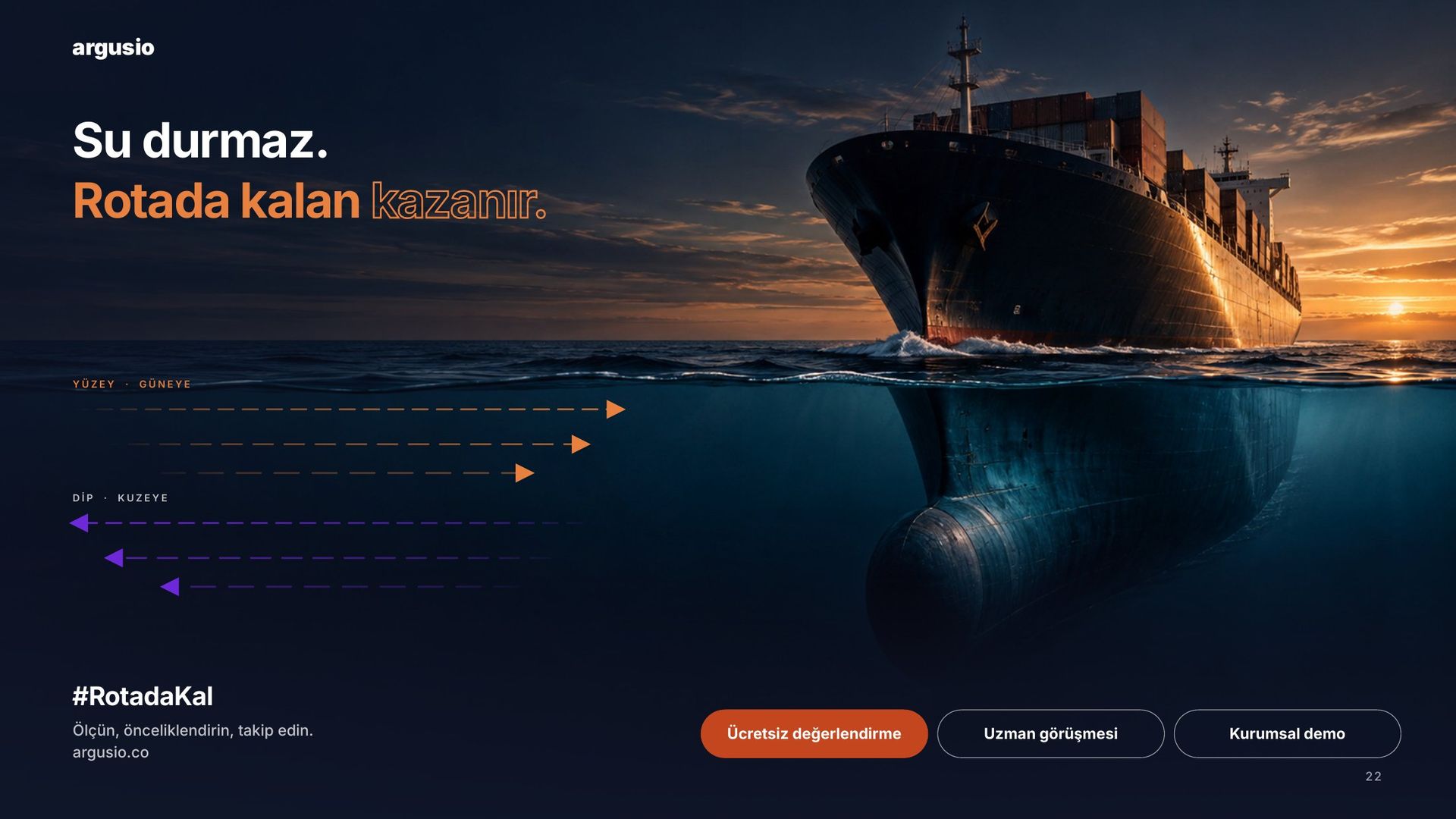
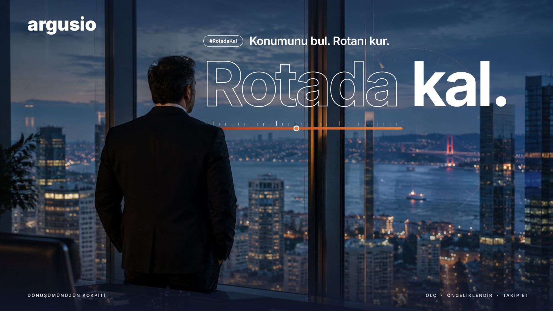
For an executive, transformation is not an abstract idea but a journey they are in the middle of. So we positioned argusio not as software but as a navigation system: it tells you where you are, draws the route and keeps the ship on course.
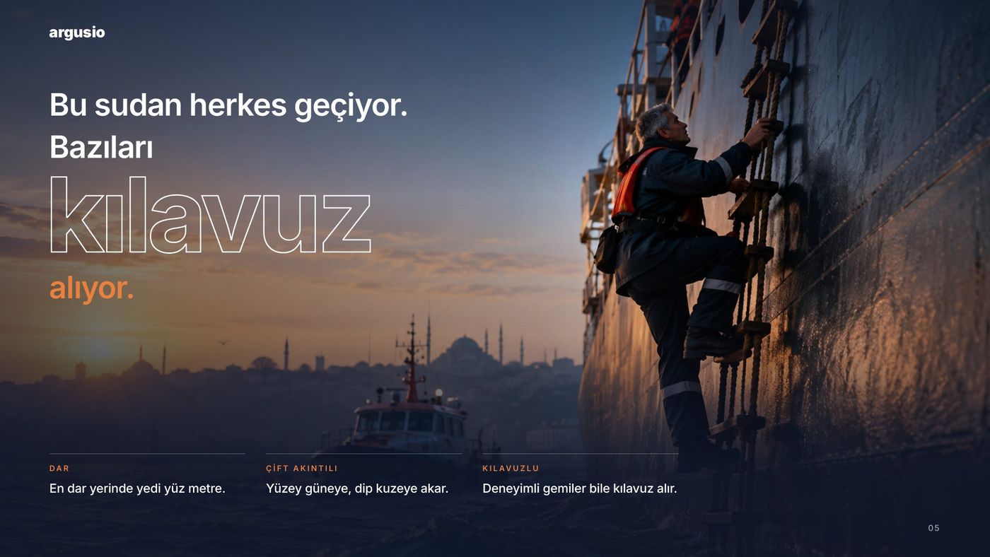
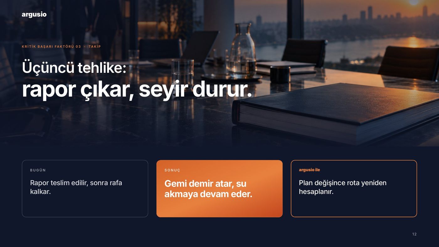
The core metaphor is the Bosphorus: a narrow strait whose current never stops, crossed safely by those who take a pilot. Transformation is not a destination but a cycle. The story is built on three dangers.
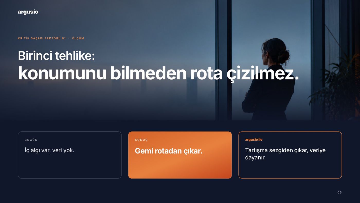
No route without knowing your position. Perception, no data.
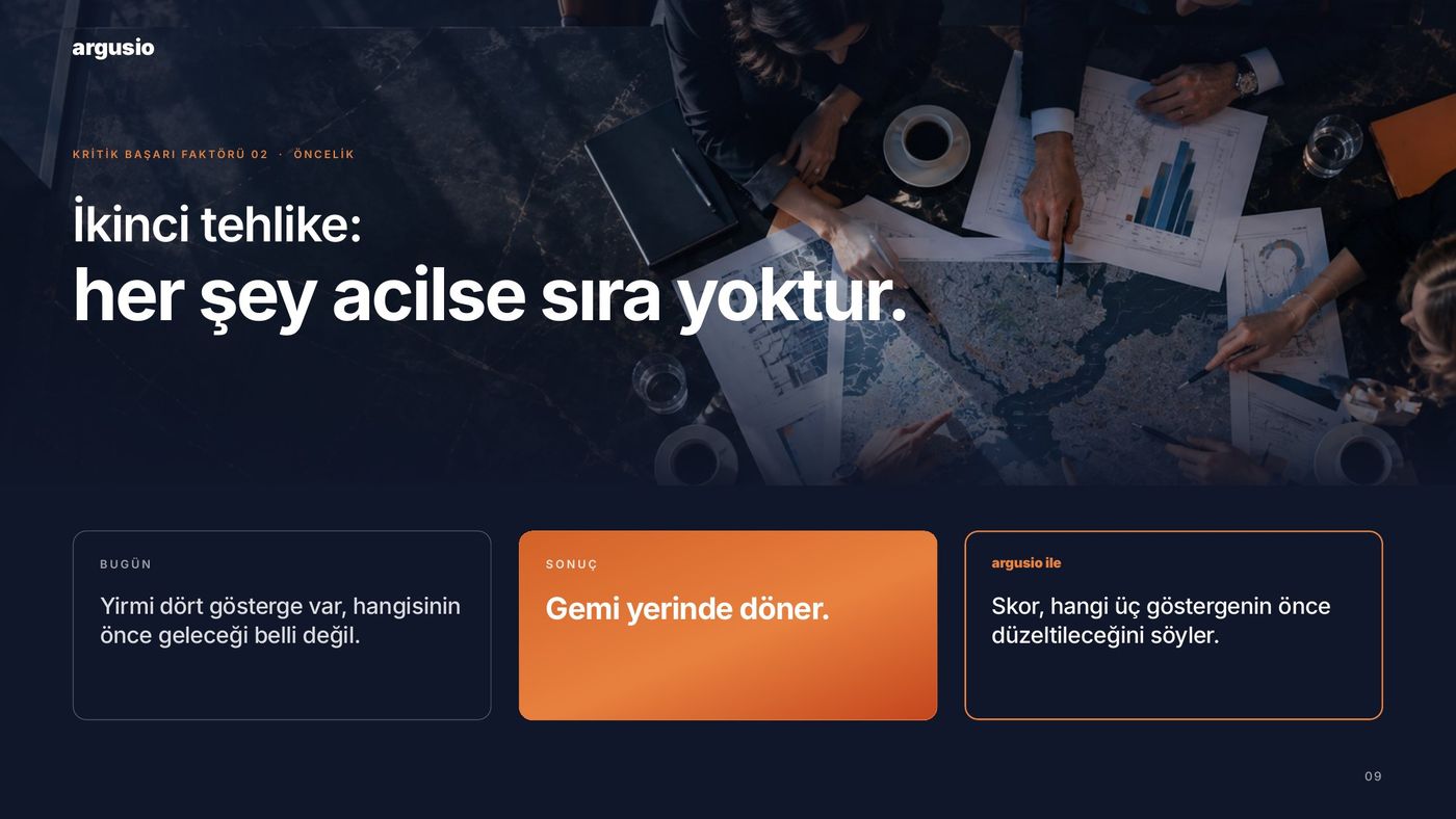
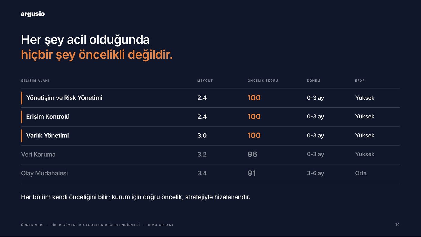
When everything is urgent, there is no order.
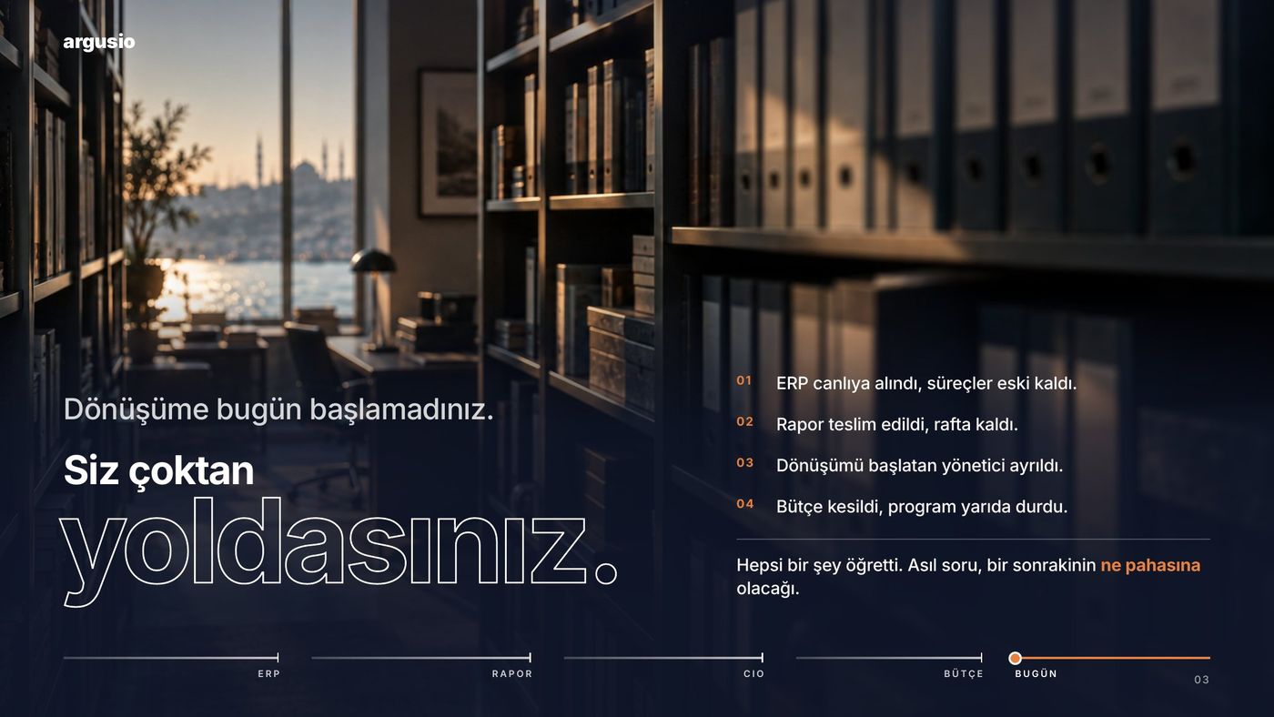
The report ships, the voyage stops. It ends up on a shelf.
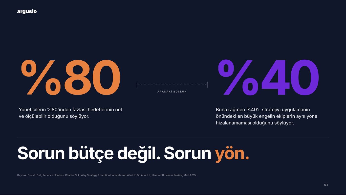
The problem isn’t budget.
It’s direction.
03 · CREATIVE WORKING SYSTEM
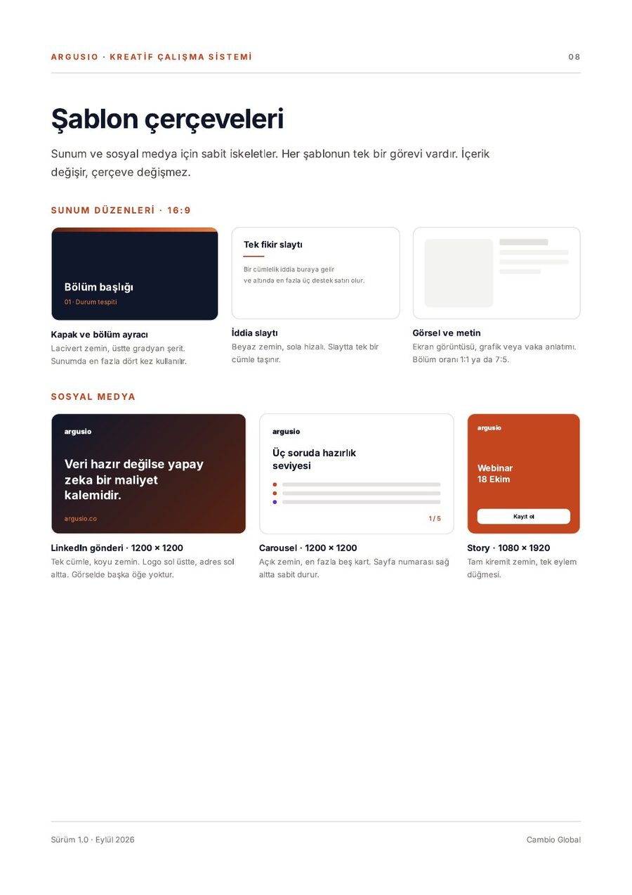
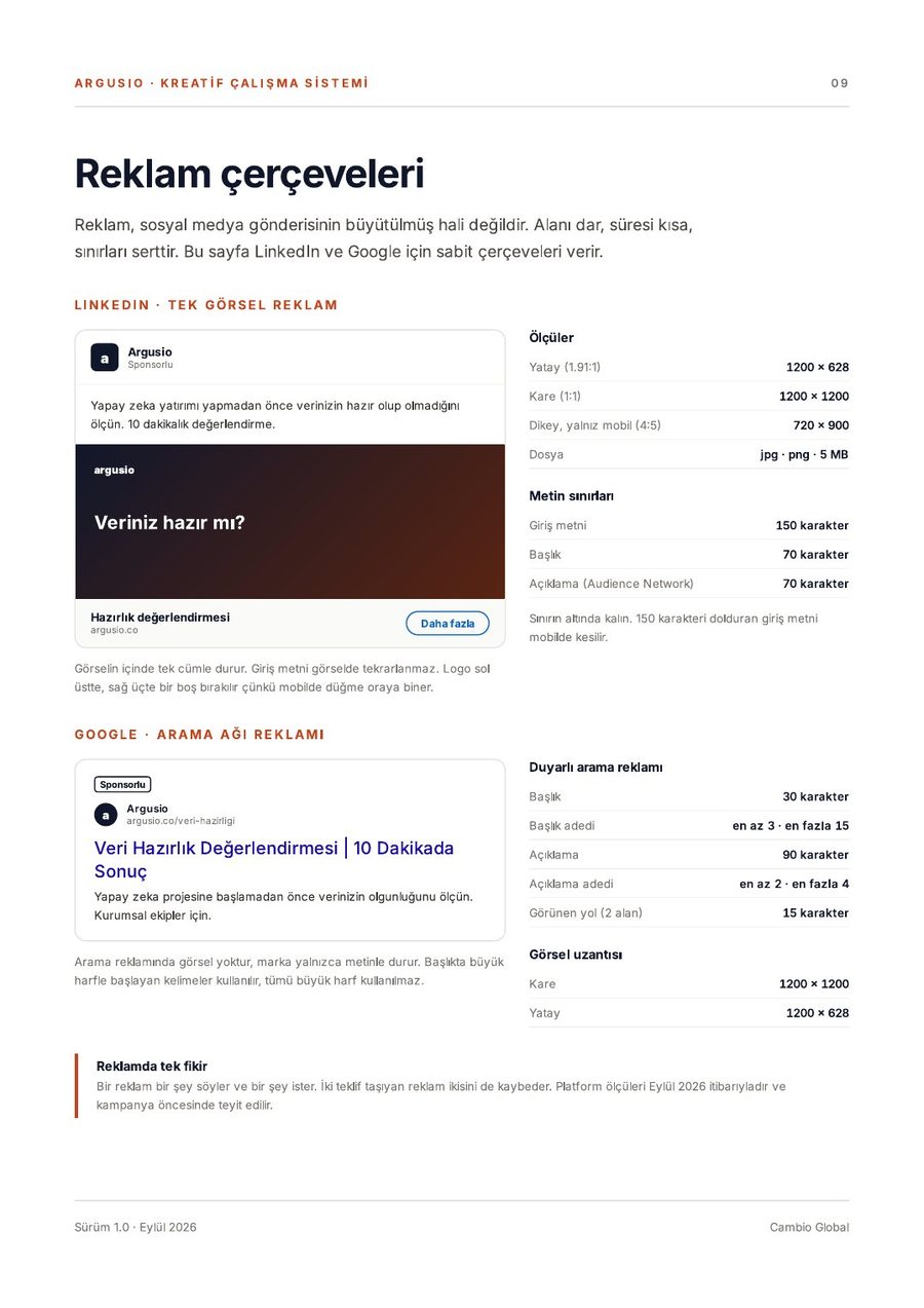
Instead of a thick brand book we wrote the minimum set of decisions so the deck and every future visual come from one hand.
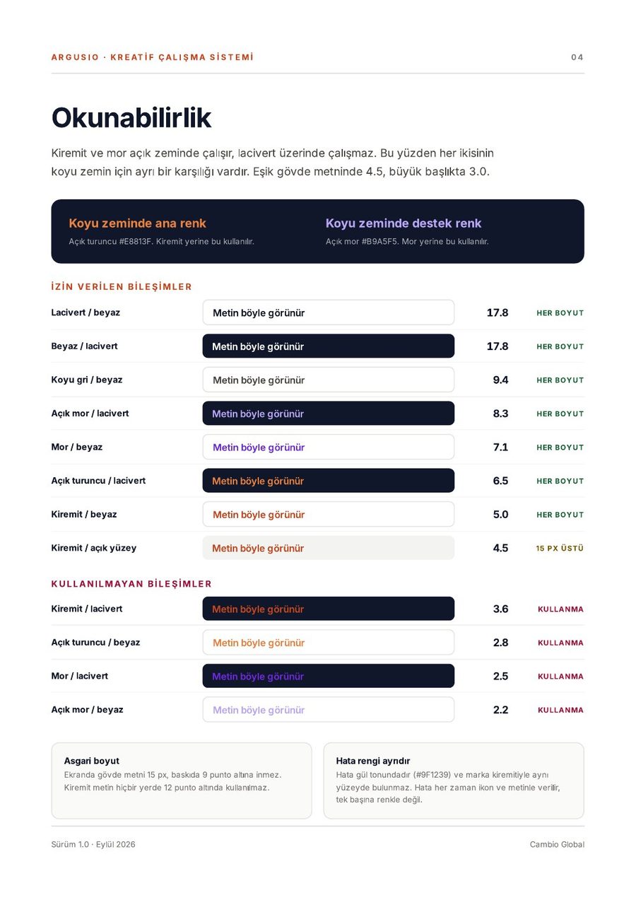
Colour, type and logo. Legibility measured, Turkish characters checked one by one, deck and social frames delivered as editable templates.
DECISION 01 · COLOUR
Brick red leads, navy gives depth. Purple marks only comparison. Colour is a matter of proportion.
#C4461E#8D28D9#10172A
DECISION 02 · TYPE
The product UI already uses Inter; deck and ads draw from the same family. No second typeface.
40 / 26 / 18 / 13
DECISION 03 · LOGO
No glow, shadow or outline. Clear space, minimum size and avatar crop defined.
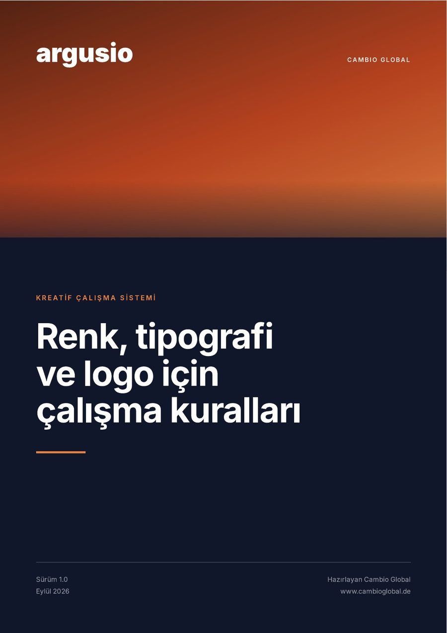
10 pagesColour · Type · Logo · Grid · Templates · ApplicationDelivered at the end of week one
04 · DECK LANGUAGE
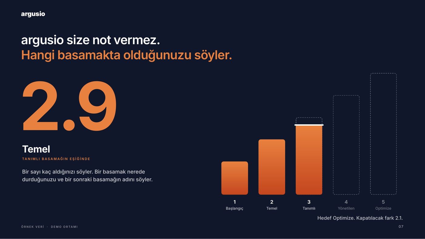
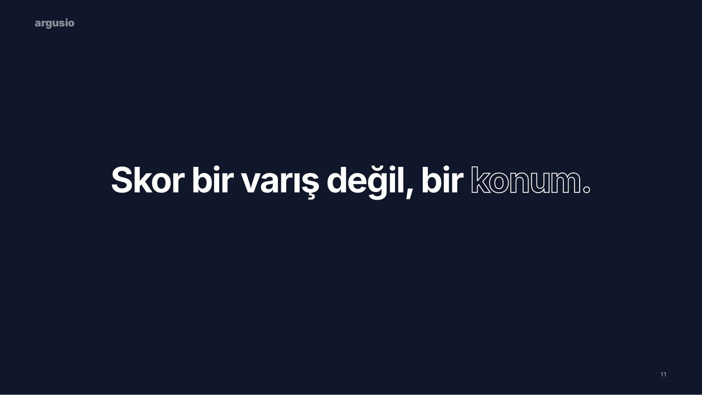
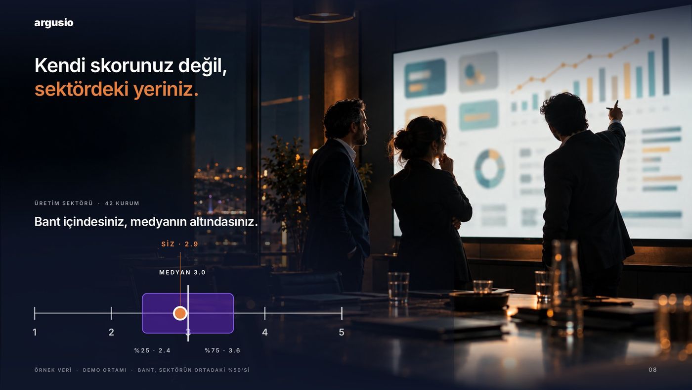
The deck has its own grammar. What is the old state, what is the decision, where you are in the deck and who is compared with whom: you see it before you read it.
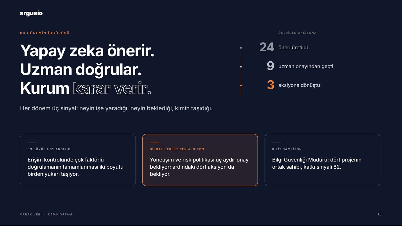
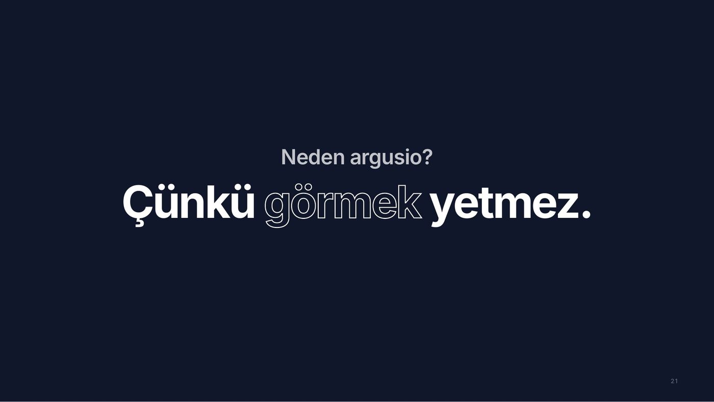
Outlined type carries the old state or the misconception; solid type the fact.
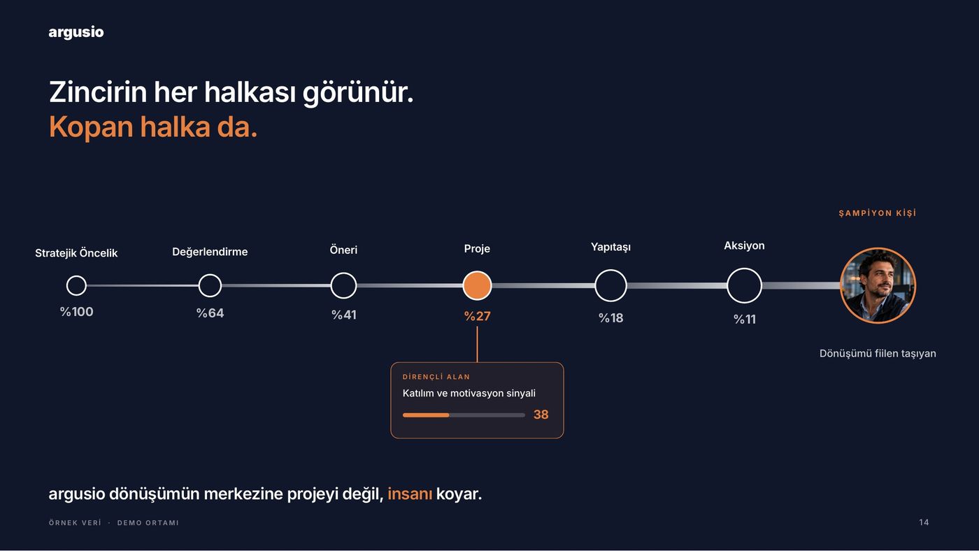
The cover ruler becomes the progress bar on every slide.
Every chart in thin lines, ticks and dashes. No stock icons.
Brick and orange show only your own position, purple only the benchmark.
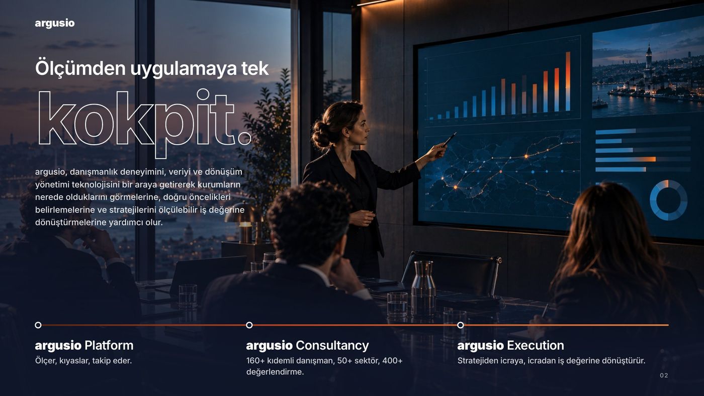
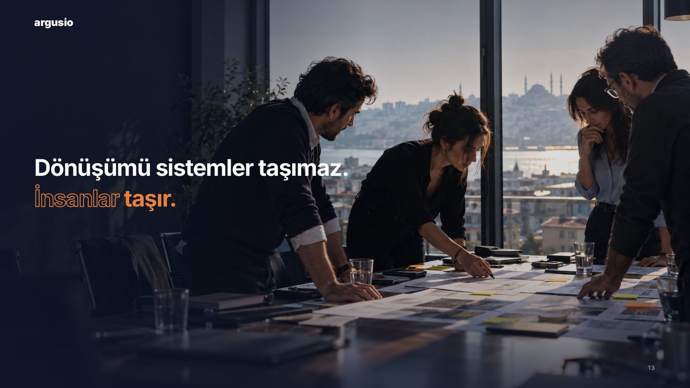
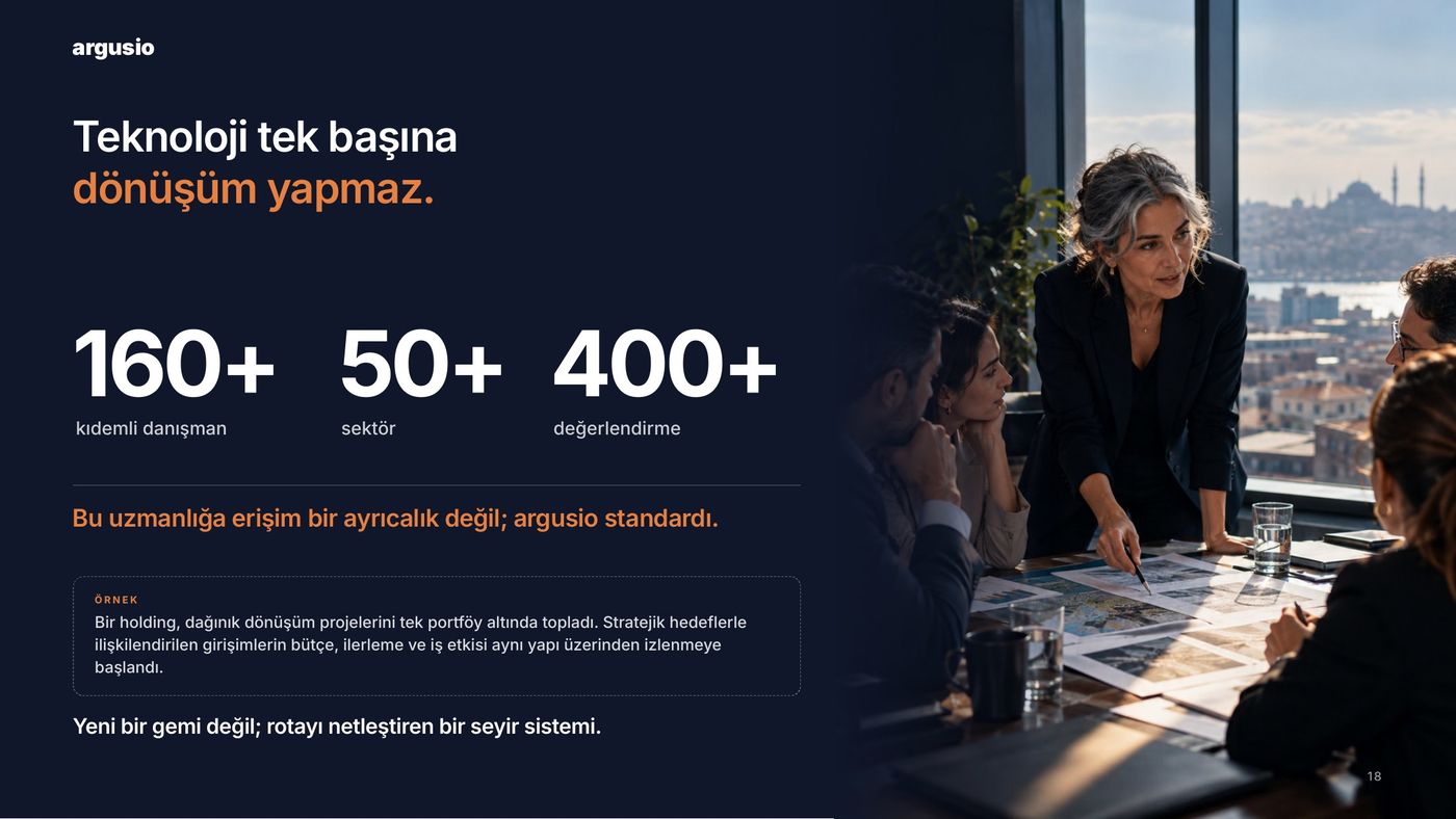
Photography lives in Istanbul at night; navy slides are breathing points.
05 · SALES NARRATIVE
Sentence first, image second. From a content workshop, competitor decks and the product itself we built the story, flow, sales copy and speaker notes.
Read the headlines in a row and you have read the deck.
06 · DECK SYSTEM
master slides, so every future presentation is built in the same language, in minutes.
07 · CORPORATE SALES DECK
Where system and story meet: an editable 22-slide sales deck, dark theme, night rhythm.
08 · DELIVERED
09 · TIMELINE
AUGUST
First call and brief
31 AUGUST
Scope and proposal
10 SEPTEMBER
Deck system delivered
18 SEPTEMBER
Sales deck and LinkedIn visuals
OCTOBER →
Monthly digital marketing